The Color Secret Behind “Instant Calm”
A modern oasis bathroom isn’t just a look—it’s a nervous-system setting. The right palette lowers visual noise, smooths contrast, and turns everyday routines into something slower and softer. In design terms, that means fewer competing hues, gentler transitions between light and dark, and finishes that feel quiet even when they’re high-end. Think of color like soundproofing for your eyes: it reduces “mental echo” so your brain can stop scanning and start settling. The best relaxing palettes also behave well in real bathrooms. They flatter skin in the mirror, stay soothing under both daylight and warm bulbs, and don’t turn muddy when paired with tile grout, stone veining, or steam. If you’ve ever loved a paint chip and then hated it after installation, you already know the trap—bathrooms are a special lighting zone, and moisture makes color feel deeper. That’s why oasis palettes aren’t only about what’s trendy; they’re about what holds steady and feels good at 7 a.m. and 10 p.m.
A: Warm white + soft sand + brushed brass—bright, flattering, and spa-like.
A: Warm neutrals, creamy whites, and gentle greige—avoid icy whites under cool bulbs.
A: Pair it with warm whites, wood tones, and warmer lighting; choose stone-gray over charcoal.
A: Yes—use matte black sparingly as an accent so it feels structured, not harsh.
A: Match paint undertones to the tile first; then pick metals and textiles that echo that undertone.
A: Not exactly—aim for “neighbor tones” so transitions are soft and intentional.
A: Choose grout close to the tile color to minimize lines and visual busyness.
A: About 10% of what you see—niche tile, towels, a tray, or a single wall.
A: Bulb temperature changes undertones; swap to warmer, higher-quality bulbs and retest samples.
A: Simplify accessories, switch to matching towels, and reduce contrast where you can (paint, hardware).
How to Choose a Palette That Feels Like a Deep Breath
Start with undertones. A “white” can lean pink, yellow, gray, or blue, and if it fights your tile or vanity, your space never feels settled. Oasis bathrooms usually live in the warm-neutral to softly-cool range—nothing too icy, nothing too golden. Next, build a simple hierarchy: one dominant background color, one supporting color, and one accent that shows up in small, deliberate moments. When everything is an accent, nothing is restful. Texture matters as much as hue. A creamy off-white on matte walls feels calmer than the same color in high gloss. A pale green in a micro-cement finish reads grounded, while the same green in shiny subway tile can feel louder because reflections multiply it. Your palette should be “steam-friendly,” too: colors that stay elegant when surfaces are damp, mirrors are foggy, and lights reflect off chrome. Finally, anchor your palette with something that doesn’t change—usually tile or stone. Paint is the easiest to swap later, so let the permanent surfaces lead. If you’re starting from scratch, pick one hero material first (a limestone-look porcelain, a soft-veined quartz, a warm oak vanity) and let color support it. That’s how you get a bathroom that doesn’t just photograph well—it actually relaxes you.
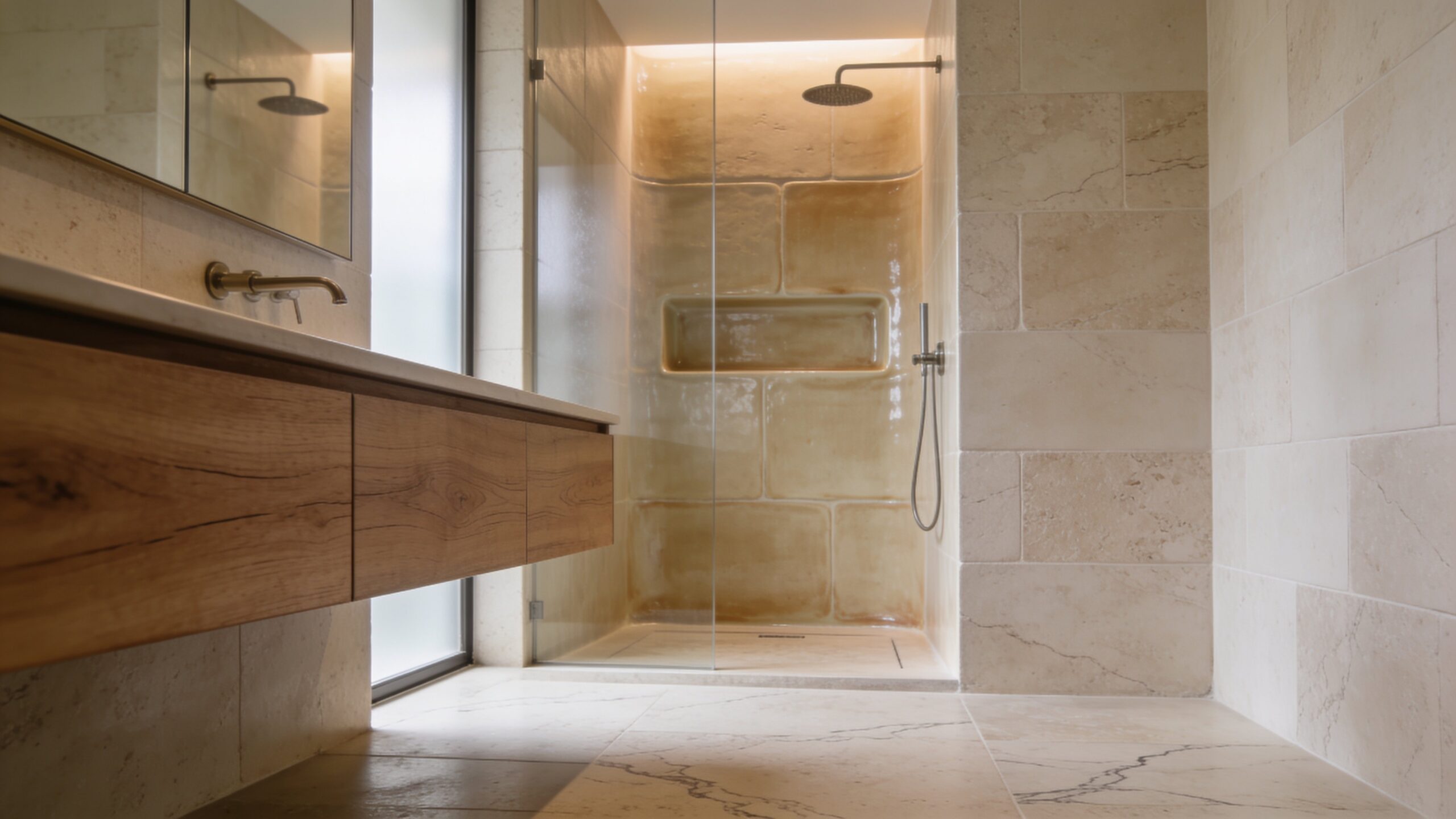
Palette 1: Soft Sand + Warm White + Brushed Gold
This is the “sunlit resort” palette—quiet, warm, and flattering. Soft sand tones on the vanity or lower walls feel grounded without getting heavy, while warm white keeps the room open and clean. Brushed gold (not shiny, not brassy) adds a gentle glow that feels like candlelight even when the overheads are on. If your bathroom has limited natural light, this palette is a cheat code: it makes everything feel brighter without going sterile.
To keep it modern, choose crisp shapes and minimal grout lines. Large-format warm-white tile, a sand-toned microcement floor, or a pale beige porcelain with subtle movement works beautifully. Add depth with materials instead of more colors—linen shower curtains, a ribbed glass sconce, or a creamy travertine tray. The mood is calm, not bland—like a spa robe and a slow morning.
Palette 2: Misty Sage + Cream + Natural Oak
Sage is relaxing because it sits between nature and neutrality. A misty, gray-green reads soft and breathable, especially when paired with creamy whites rather than bright, stark ones. Natural oak (or any light wood with a warm undertone) makes this palette feel human and welcoming, not overly “designed.” It’s the modern oasis answer for people who want serenity with a hint of life.
Use sage on a vanity, built-in niche, or a single wall if you’re cautious. Creamy walls and warm tile keep it from tipping cold. Black can work here, but use it like punctuation: a thin-framed mirror, a discreet shower hinge, a single line in a sconce. Finish with a plant that actually likes humidity—your palette will feel intentional instead of decorative.
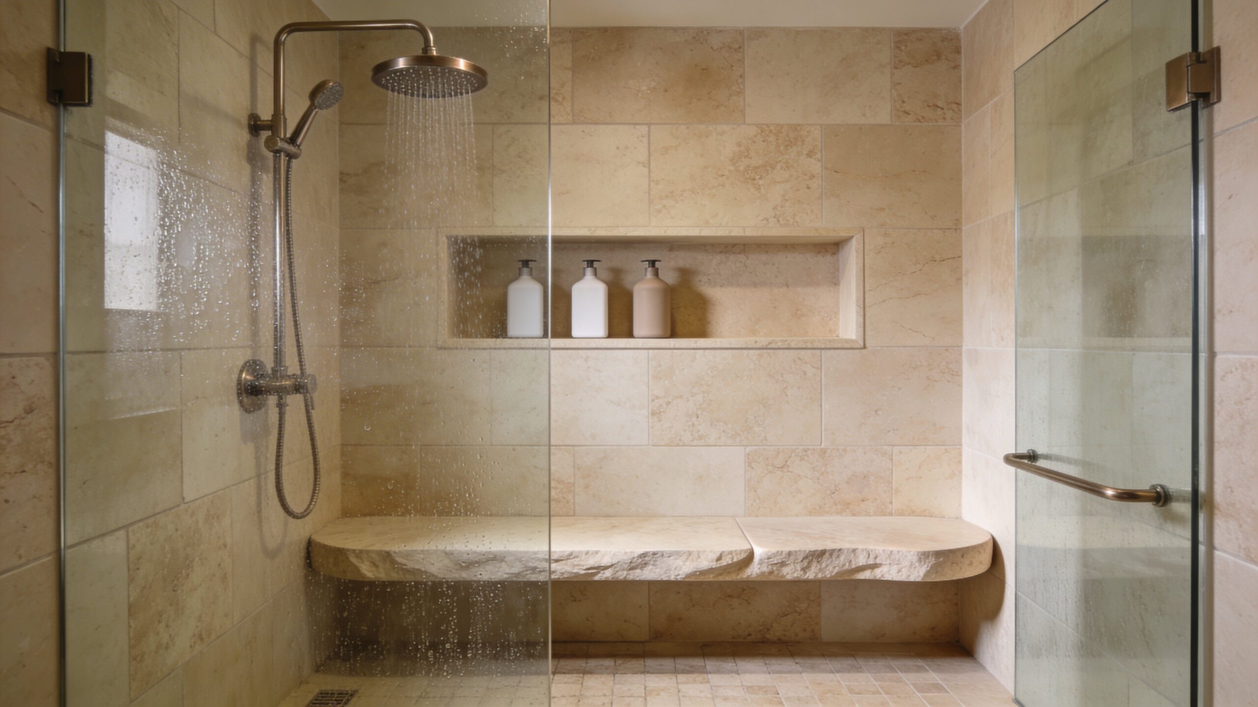
Palette 3: Stone Gray + Cloud White + Matte Black
This one is quiet-luxe—like a boutique hotel that whispers instead of shouts. Stone gray is calmer than charcoal because it has air in it, and cloud white keeps the space from becoming heavy. Matte black adds structure, defining edges and making the palette feel modern and crisp. The trick is balance: if black is everywhere, it becomes harsh. If it’s just in the right places, it feels confident and serene.
Keep the gray in the mid-to-light range for an oasis vibe, especially in smaller bathrooms. Pair it with soft lighting and warm textures so it doesn’t feel clinical. A plush white towel, a subtly textured bath mat, and a slightly warm mirror light will turn this palette from “minimal” into “restful.”
Palette 4: Sea Salt Blue + Soft White + Polished Nickel
If you want the calm of coastal without the theme-park seashell vibe, this is it. Sea-salt blue is a pale, airy blue with a gray undertone—more horizon than ocean. Soft white keeps it gentle, and polished nickel (or chrome used carefully) reflects light in a clean, water-like way. This palette is especially soothing in bathrooms with daylight, because it reads fresh and expansive.
Use blue in one consistent material story: a painted vanity, a stacked tile shower, or a wainscot wall. Let the rest stay soft and simple. If you add pattern, keep it subtle—think faint veining, not busy prints. The goal is a space that feels like stepping into a quiet shoreline morning.
Palette 5: Blush Beige + Warm Ivory + Soft Brass
Blush-beige is the most underrated modern oasis color because it’s not “pink”—it’s warmth with softness. In bathrooms, it’s incredibly flattering and makes harsh light feel kinder. Pair it with warm ivory for that creamy, serene backdrop, then add soft brass for gentle shine. This palette feels like skincare: comforting, luminous, and quietly elevated.
To keep it modern, avoid overly ornate fixtures. Choose clean lines, minimal hardware, and contemporary lighting. A blush-beige vanity with ivory walls and brass accents can feel both spa-like and stylish. Add a stone tray, a neutral candle, and a towel color that matches your ivory rather than competing with it.
Palette 6: Deep Olive + Warm White + Antique Bronze
If you want a modern oasis that feels like a forest retreat, deep olive is the move. It’s grounding, protective, and surprisingly restful when paired with warm white and antique bronze. The key is using olive strategically so it doesn’t dominate—think vanity, lower cabinetry, or a single shower wall. Warm white on the upper walls and ceiling keeps everything airy.
This palette is incredible with natural stone, especially anything that looks like limestone or travertine. Bronze adds a vintage warmth that makes the space feel curated, not cold. Finish with soft textiles—waffle towels, a plush mat—and you’ll get a bathroom that feels like a quiet cabin spa without leaning rustic.
Palette 7: Greige + Linen + A Hint of Charcoal
Greige (that sweet spot between gray and beige) is the ultimate neutral for relaxation because it doesn’t tug the room warm or cool too aggressively. Pair it with linen tones for warmth, and add just a hint of charcoal for depth. This palette is ideal if you want something timeless that won’t feel dated in two years—and it plays nicely with almost any tile or stone. Let greige be the wall color or the main tile tone. Linen can show up in textiles, woven baskets, or a light wood vanity. Charcoal should stay minimal: a faucet, a slim mirror frame, or a shower trim line. The result is quiet, soft, and clean—like a luxury hotel suite designed for sleep.
Palette 8: Monochrome Creams With Texture Instead of Contrast
Some of the most relaxing bathrooms aren’t “colored” in the obvious sense—they’re tonal. Cream on walls, cream on tile, cream on textiles—but with enough texture to keep it from feeling flat. This palette reduces visual friction and lets your brain stop sorting shapes and colors. The room feels like a soft-focus photograph.
To make this work, layer finishes: matte paint, lightly textured tile, stone with subtle variation, and textiles with weave. Use lighting as a design element—warm, diffused, and preferably from multiple sources. Add contrast with shadow, not color: ribbed glass, fluted wood, and gentle curves.
How to Make Any Palette Feel More Relaxing
Even the best colors can feel wrong if the lighting is harsh. Soft, warm lighting is the secret ingredient of oasis design. Aim for a balanced glow—something that doesn’t create sharp shadows on the face, and doesn’t turn your walls yellow. If your bathroom is windowless, lean into a warm-neutral palette and add layered light: mirror lighting plus ceiling lighting plus a small accent light if possible.
Control “hard shine.” High-gloss surfaces, busy grout lines, and reflective clutter make a room feel louder. Choose calmer finishes—satin paint, honed stone, matte hardware, larger tile where practical. Then simplify the visual field: keep counters clear, store bright packaging, and choose a few cohesive accessories instead of many. Relaxation is often just the absence of interruption.
Easy Pairings: Materials That Always Look Calm
If you want a reliable modern oasis formula, pair your palette with materials that read soft and natural. Light oak, warm walnut, limestone-look porcelain, and gently veined quartz all support relaxation because they don’t create sharp contrast. For metals, brushed or softened finishes feel calmer than high-polish in most palettes. And for textiles, stick to whites, creams, and muted tones that echo your walls rather than fighting them.
Plants, if you use them, should look intentional. One strong green moment feels calmer than several small ones. The same goes for art: one large piece in quiet tones is more relaxing than a collage of prints. Your oasis bathroom should feel edited—like the room knows what it is, and doesn’t need to prove it.
Mistakes That Break the Oasis Mood
The biggest mistake is choosing “pretty colors” that don’t match your fixed surfaces. A cool paint next to warm tile can make the room feel unsettled, even if each item is beautiful on its own. Another common misstep is too much contrast—bright white next to deep black everywhere—because the eye keeps pinging between extremes. In an oasis bathroom, contrast should be gentle, not dramatic.
The third mistake is forgetting scale. Tiny tiles with heavy grout lines add visual busyness, especially in showers. Overly complex patterns can feel energizing, not calming. And finally, lighting temperature mismatches can ruin everything: if your bulbs are too cool, warm palettes can look dull; if bulbs are too warm, cool palettes can look muddy. Your color palette isn’t finished until the lighting agrees.
Your “Instant Relax” Palette Roadmap
If you want the fastest path to calm, pick one of these directions and commit: warm and sandy, green and natural, gray and hotel-clean, or blue and airy. Keep the palette limited, let texture do the heavy lifting, and choose metals that support your mood rather than competing with it. Modern oasis design isn’t about having more—it’s about having fewer things that feel better together. Once you get the palette right, your bathroom starts working like a reset button. The air feels quieter. The mirror light feels kinder. The room stops asking for attention—and starts giving it back.